
Long-term branding and awareness partnership
Preserve the Curves
Branding, Marketing and Audience-Centered Communication
Preserve the Curves is a long-term branding and awareness partnership created to help plus-size women feel beautiful, confident, and worthy exactly as they are, while encouraging sustainable steps toward lasting health and wellness.
The brand's strategy was rooted in a broader belief: when women feel supported in caring for their health, that positive change can create a ripple effect throughout their families, households, and communities. Preserve the Curves focused on reaching women through inclusive messaging, relatable imagery, accessible wellness services, and products designed specifically with their experiences in mind.

Role, Audience, Objective and Scope
My Role
Brand and Marketing Designer
I supported the brand across identity, digital experiences, campaigns, product launches, and audience-facing communications.
Target Audience
Plus-size women
Women seeking an inclusive and supportive approach to wellness, fitness, confidence, and long-term health.
Marketing Objective
Build awareness and trust
Reach an audience often excluded or poorly represented in traditional fitness marketing while promoting services and expanding consumer product lines without shame-based messaging.
Scope
A long-term creative partnership
Brand development, rebranding, website design and redesign, marketing strategy, campaign creative, promotional messaging, social media content, product packaging, brochures, advertising, and visual content production.
Brand Positioning and Marketing Strategy
Brand Positioning
The central message balanced self-acceptance with personal growth: women could love and appreciate themselves as they were while still choosing to improve their health.
The brand presented wellness as an act of care rather than punishment.
Marketing Strategy
Preserve the Curves needed more than a recognizable logo. It needed a flexible brand and messaging system that could move between body-positive advocacy, fitness services, wellness products, seasonal promotions, and direct-response advertising without losing the trust of its audience.
I translated that positioning across websites, social media, product packaging, promotional campaigns, brochures, sales materials, and distributor communications. As the company evolved, I helped adapt and extend its identity while preserving its original purpose and audience connection.
Selected Campaigns and Marketing Work
These examples show how the brand moved from audience strategy into timely offers, service promotions, and seasonal communication. Each campaign used a different message while maintaining an approachable, audience-aware voice.
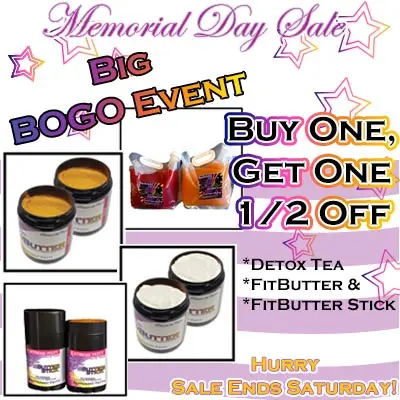
Campaign 01
Memorial Day Product Promotion
- Intended Audience
- Existing and prospective customers interested in the brand's wellness products.
- Marketing Objective
- Create timely product interest through a clear, limited-duration seasonal offer.
- Core Message
- A buy one, get one half-off promotion across selected tea and Fit Butter products.
- Call to Action
- Purchase the featured products before the Saturday sale deadline.
- My Contribution
- Campaign concept, promotional hierarchy, product presentation, offer messaging, and final advertising graphic.
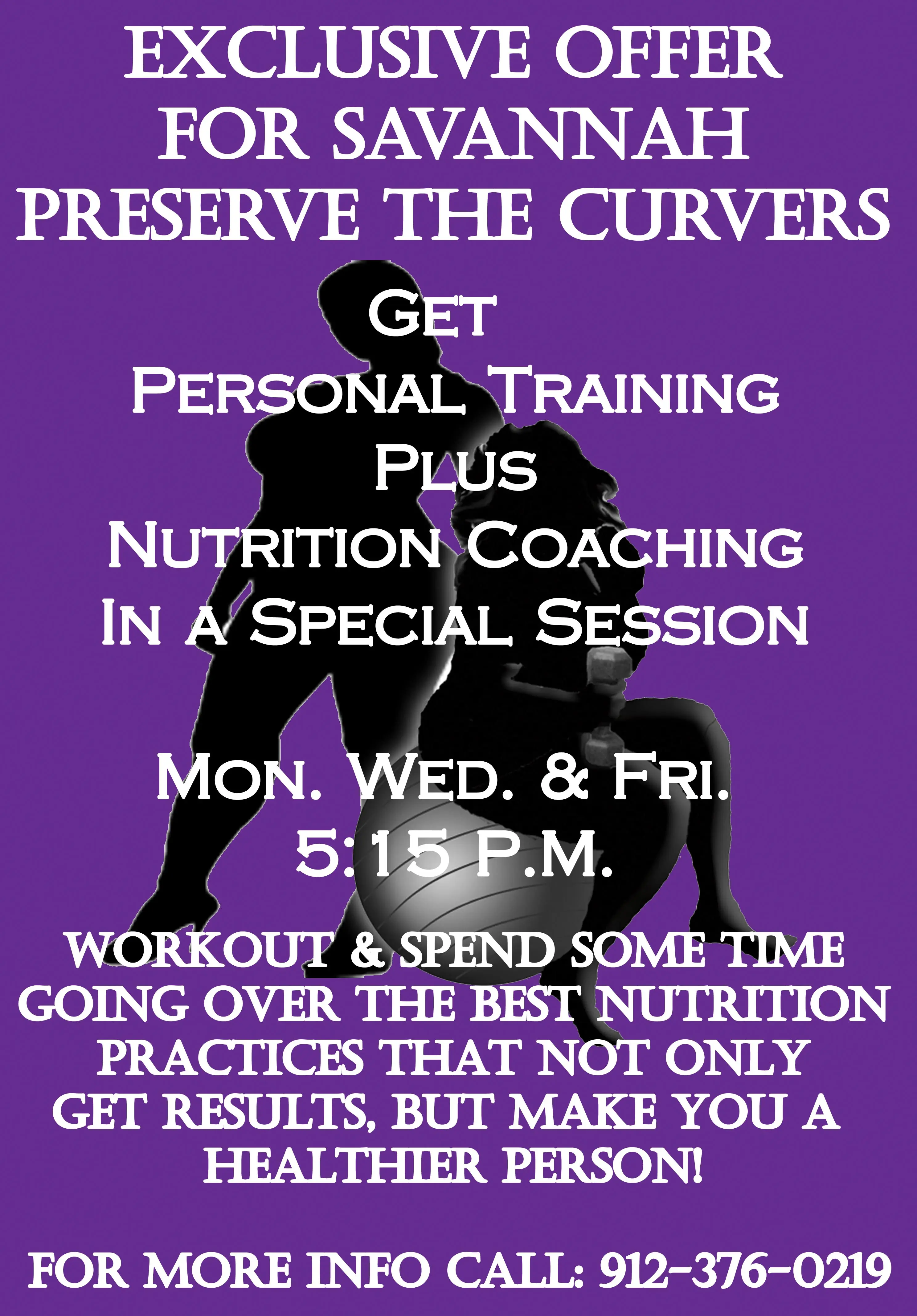
Campaign 02
Savannah Personal Training Offer
- Intended Audience
- Savannah-area women looking for an inclusive personal training experience.
- Marketing Objective
- Present personal training as accessible, supportive, and tailored to the intended audience.
- Core Message
- A focused training opportunity created for women who wanted personalized guidance in a welcoming setting.
- Call to Action
- Contact Preserve the Curves to inquire about the offer and available training options.
- My Contribution
- Offer presentation, audience-focused messaging, visual hierarchy, image treatment, and promotional design.
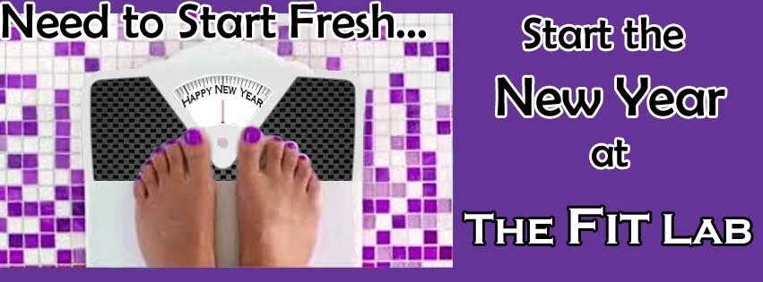
Campaign 03
New Year Fit Lab Campaign
- Intended Audience
- Women seeking a supportive way to begin or renew their wellness goals in the new year.
- Marketing Objective
- Connect a seasonal moment of motivation to the brand's fitness services without using shame-based language.
- Core Message
- The new year could be approached as a supported, positive step toward personal wellness.
- Call to Action
- Join the Fit Lab program and begin the seasonal fitness experience.
- My Contribution
- Campaign direction, message hierarchy, seasonal creative, audience framing, and final social advertisement.
Additional Marketing and Social Content
The gallery preserves the broader range of audience-facing creative while keeping the strongest strategic campaign examples at the front of the case study.
Website and Digital Experience
The digital work supported the brand through two generations of website design. Each stage responded to changing services, product offerings, and audience needs while maintaining the brand's inclusive message.
The website experience connected brand storytelling, fitness services, products, and promotional content within one recognizable visual system.
Original Website
Established the brand's mission, service story, and audience promise within its first full digital presentation.
Fitness Sub-Brand
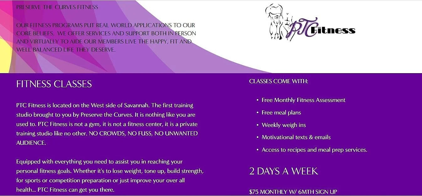
Extended the digital identity to support dedicated fitness services while remaining visibly connected to Preserve the Curves.
Website Redesign
Refreshed imagery, presentation, and content structure as the brand expanded into additional products, services, and marketing needs.
Product Packaging and Promotional Materials
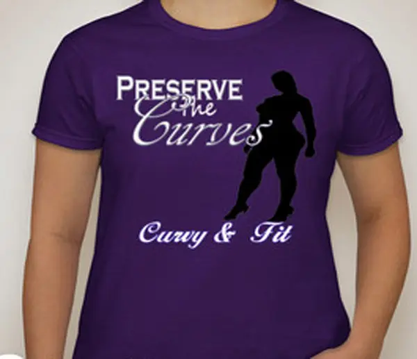
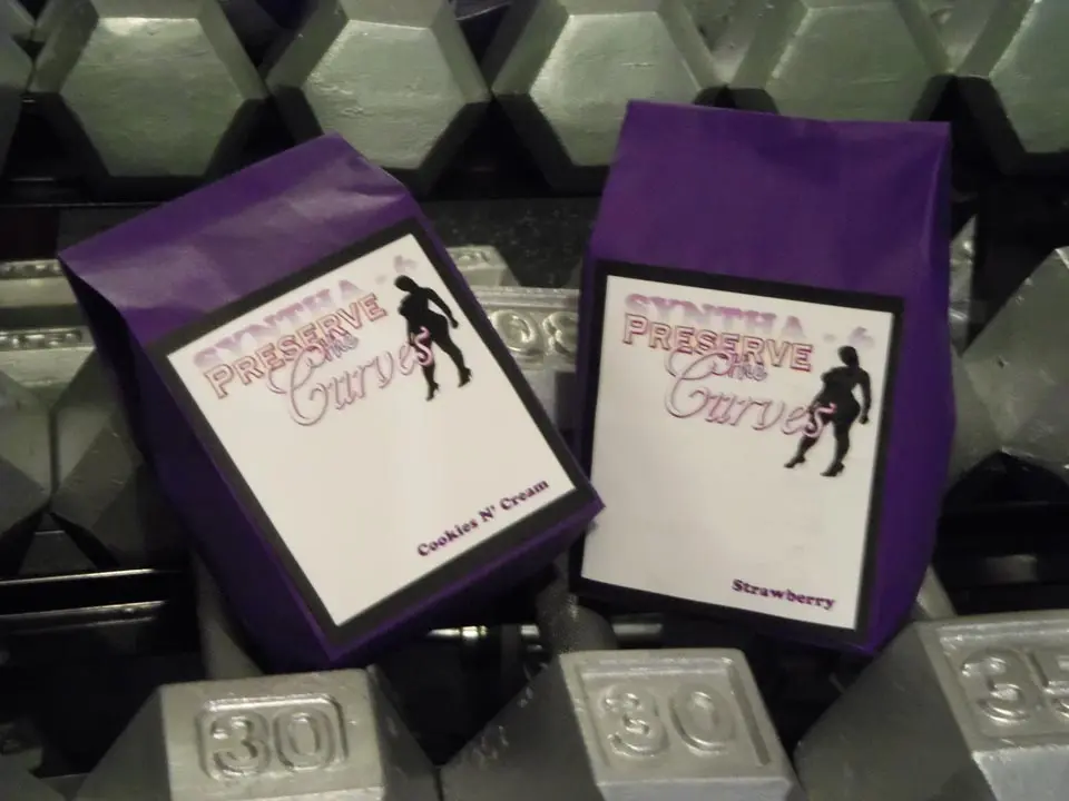
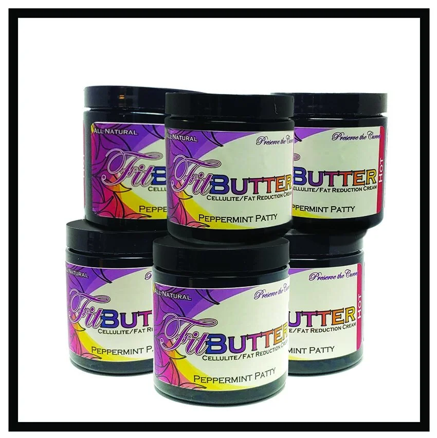
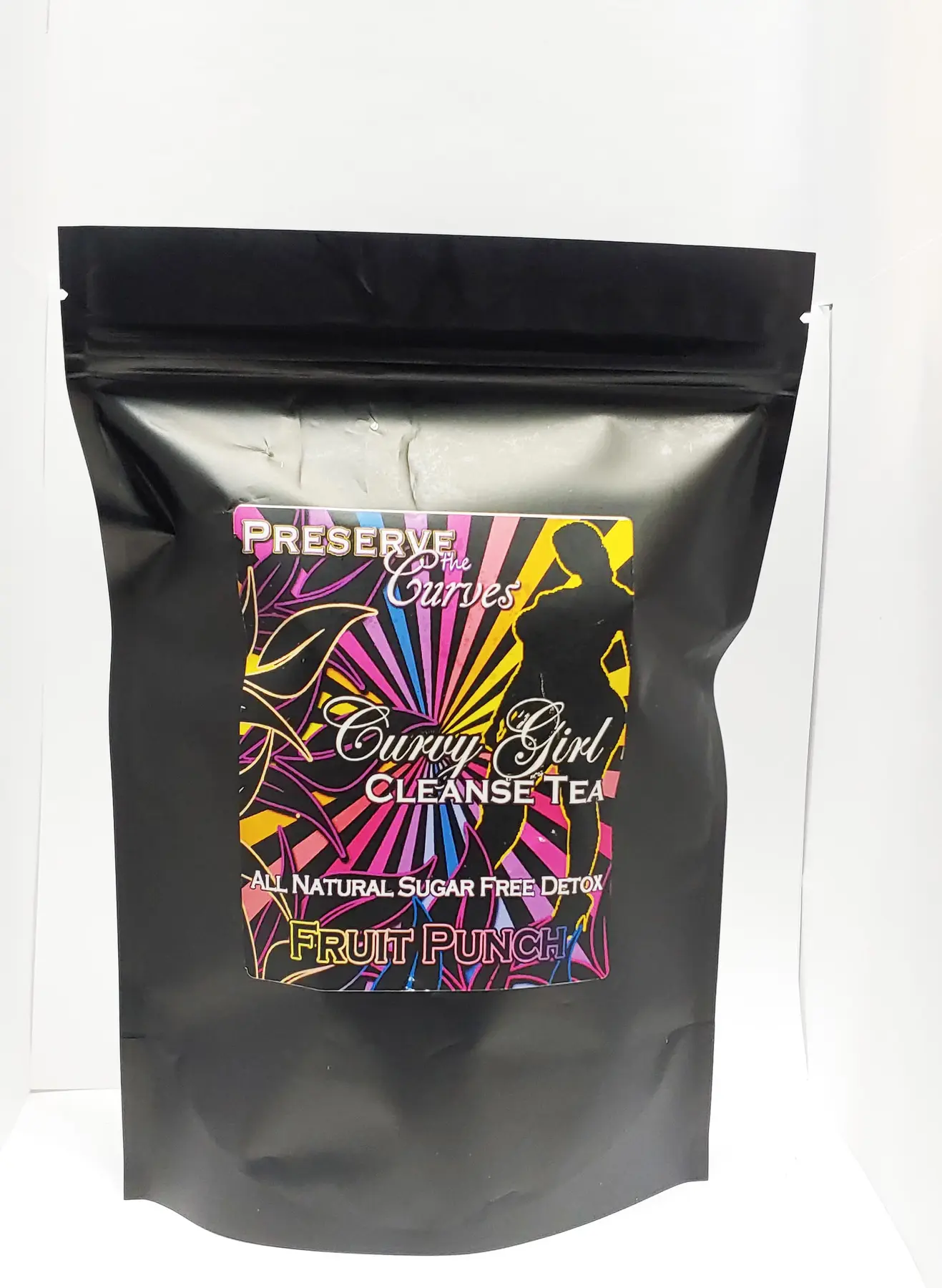
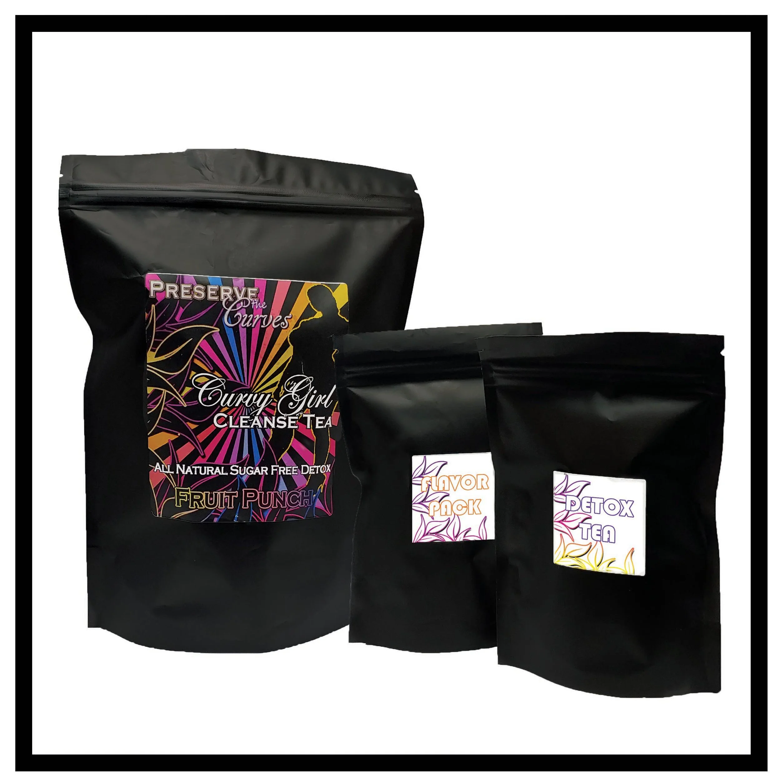
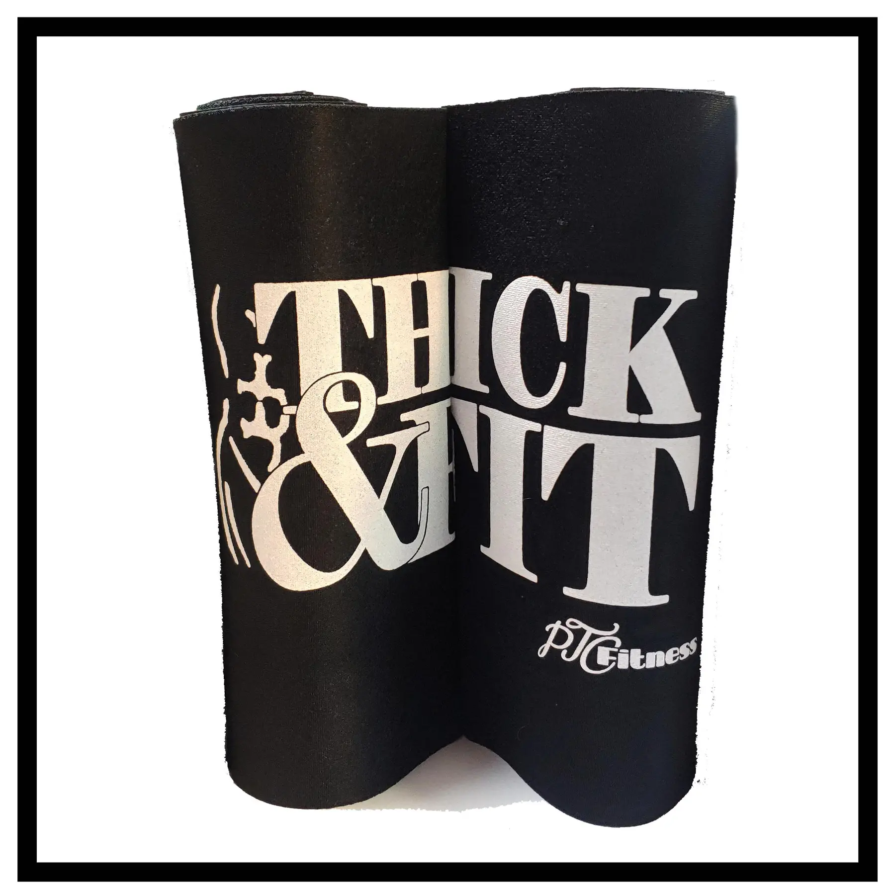
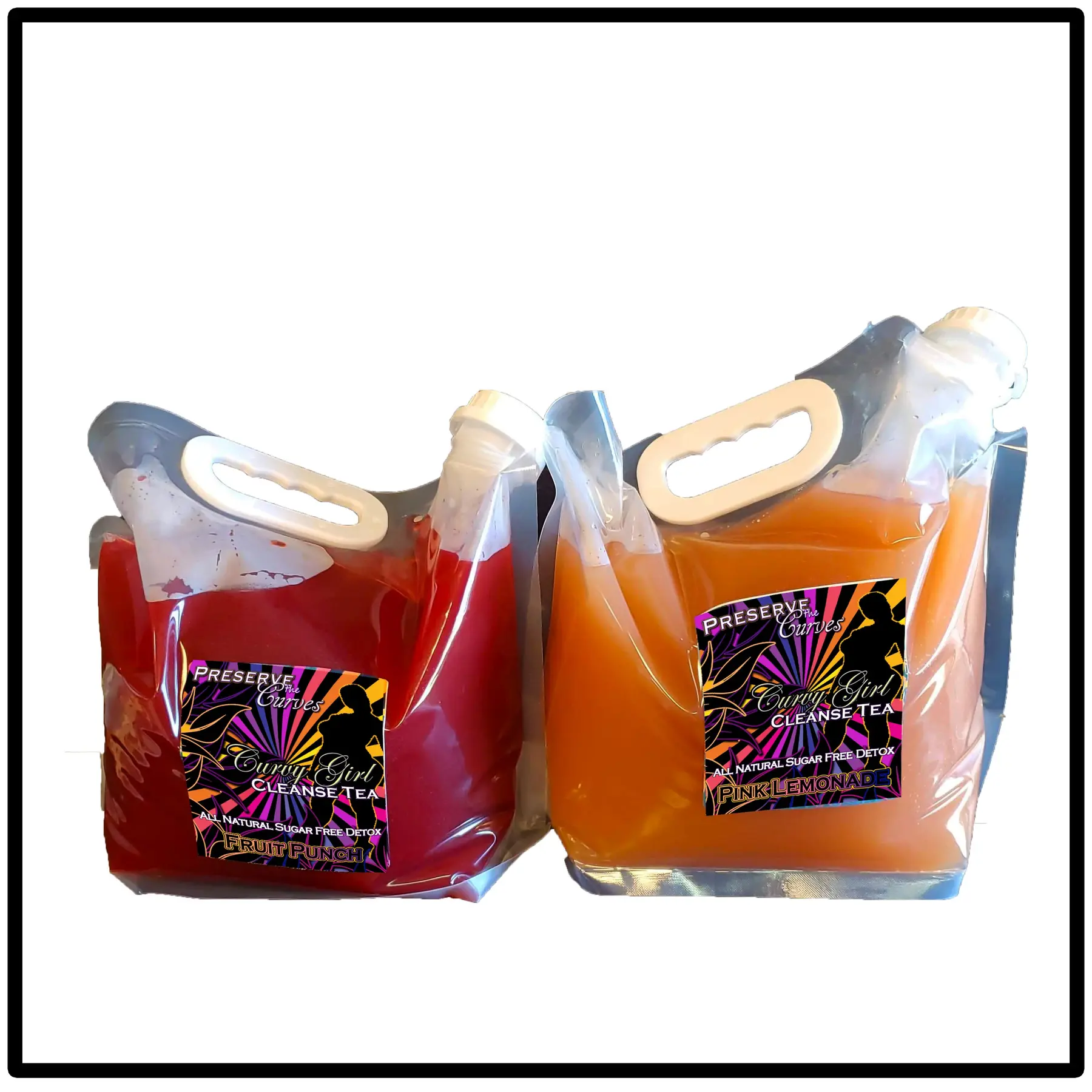
As Preserve the Curves expanded beyond services, the visual system needed to support consumer products and distributor communication. Packaging and promotional materials carried recognizable color and brand cues into new formats without losing the inclusive tone established by the core identity.



Distributor and Product Marketing
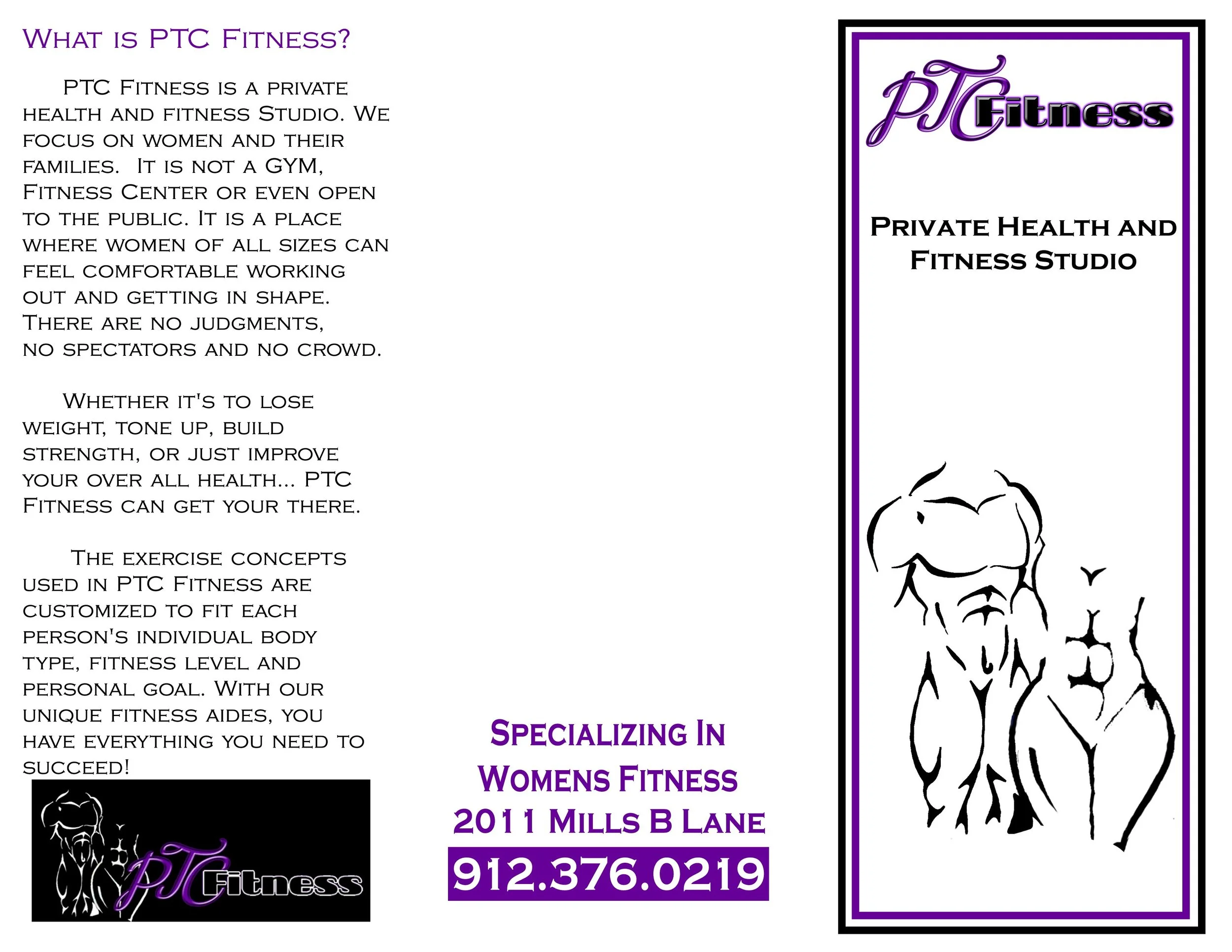
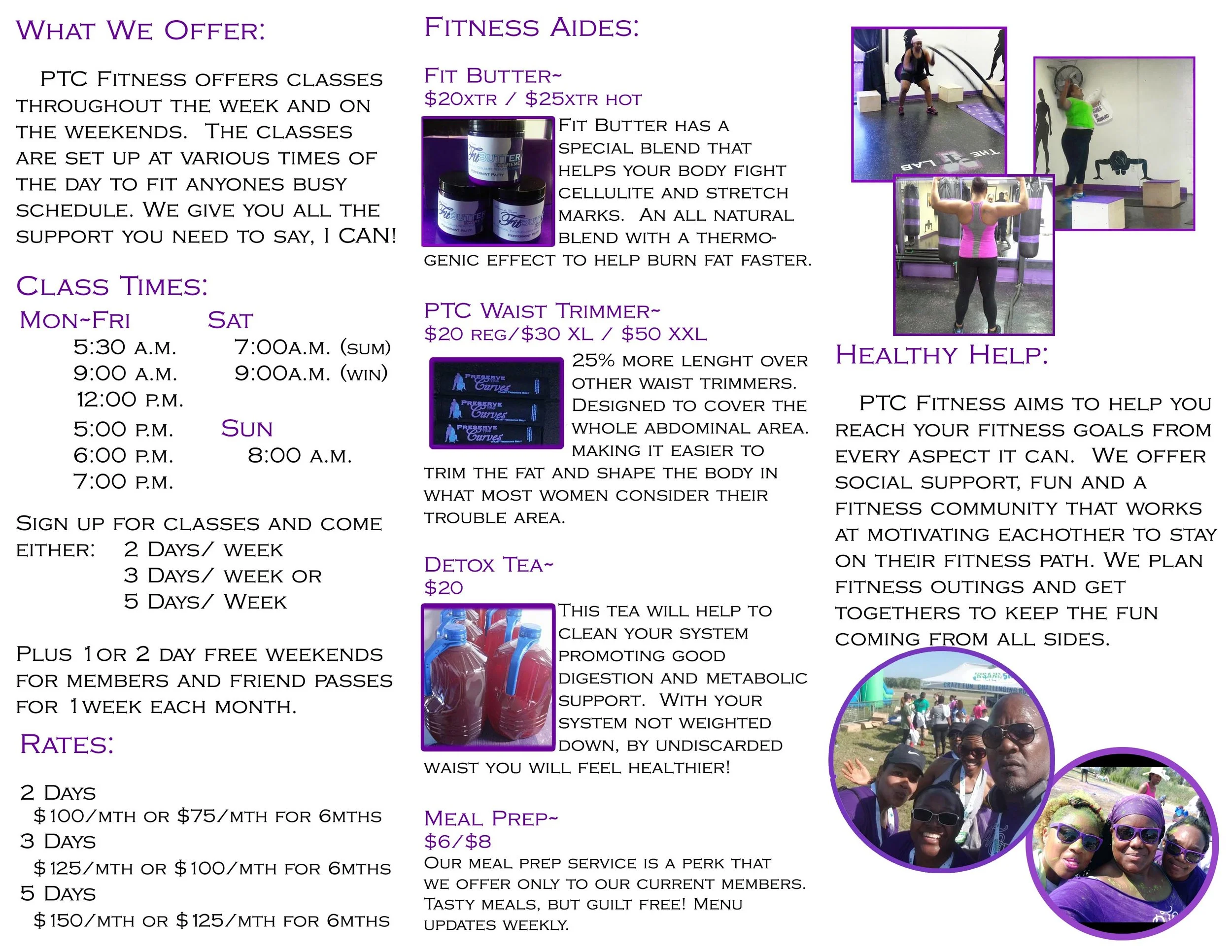
Interactive inserts and sales materials explained the product family, supported distributor conversations, and kept promotional information within the established brand system.
Click the stack to bring the next piece forward.
Brand Evolution
Preserve the Curves developed over many years as its services, products, and fitness programming expanded. These examples document how I adapted the identity through new offers and brand extensions while keeping its original audience and purpose visible.
The earlier visual language belongs to a previous design era. It is presented here as evidence of longevity, brand stewardship, and the ability to evolve a working identity rather than as the current creative direction.
Early Digital Foundation
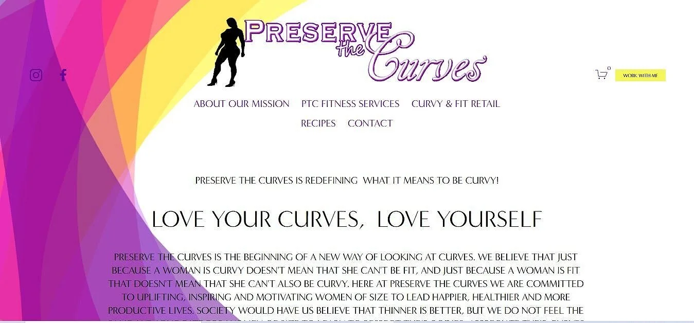
Original Website and Brand Presentation
The first digital experience established the profile motif, purple palette, mission, and connection between confidence, fitness, and wellness.
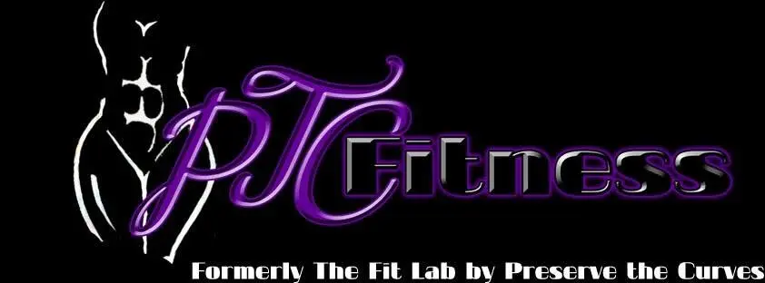
The updated signature documented the fitness program's transition while explicitly retaining its connection to Preserve the Curves.
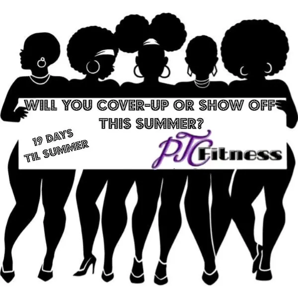
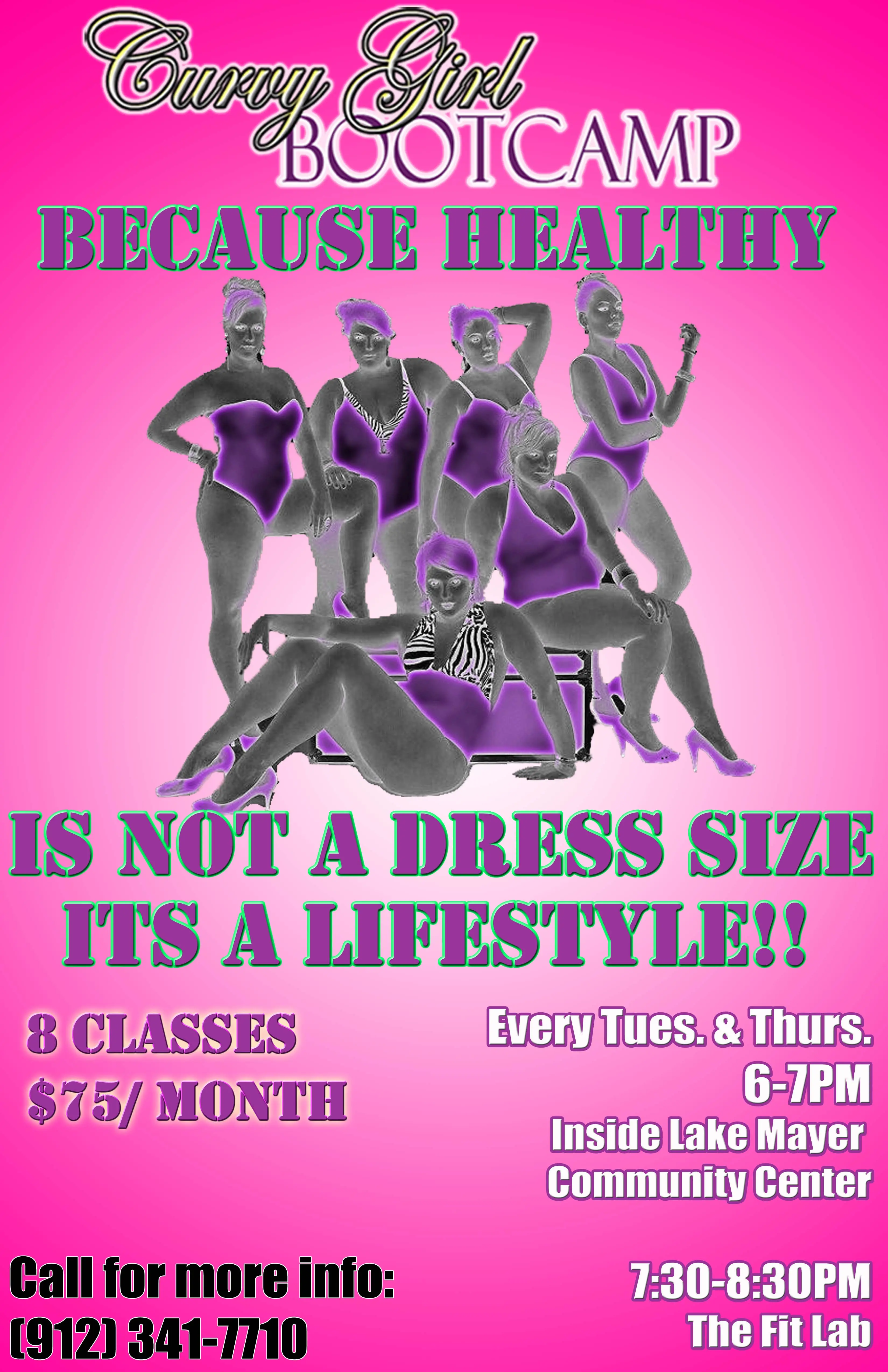
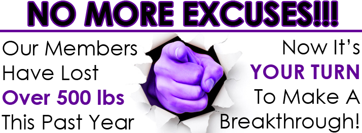
The campaign used direct, body-positive language to speak to the audience without asking women to reject their present bodies.

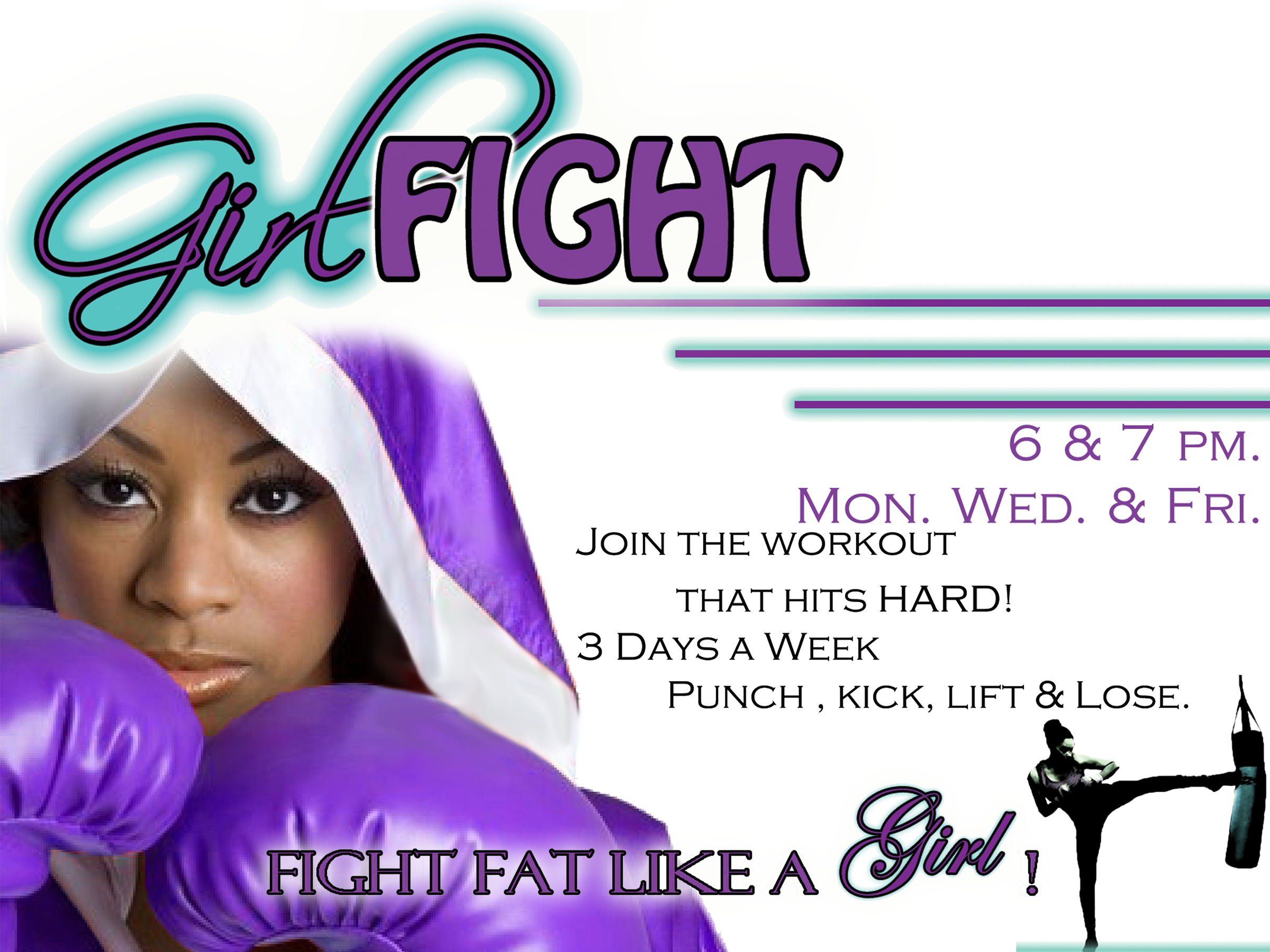
A focused program identity extended the brand into another fitness service while keeping its audience-specific positioning visible.
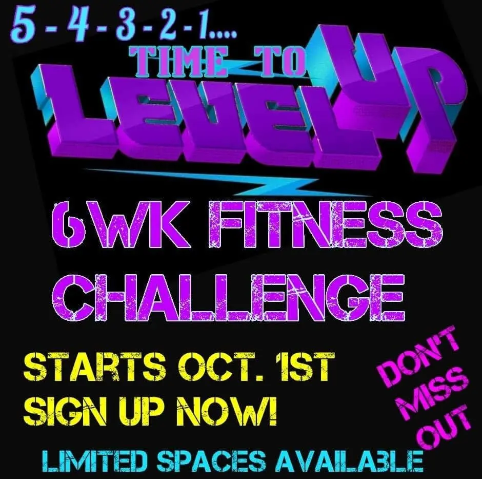
A later challenge campaign shows how the fitness offering continued to evolve through structured, time-bound programs.
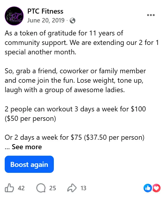
The dated social post provides direct evidence of a long-running client relationship and sustained usefulness across multiple stages of the brand.
Project Value and Transferable Skills
What This Project Demonstrates
- Long-term client and brand stewardship
- Audience-specific marketing strategy
- Inclusive brand voice and messaging
- Website design and redesign
- Promotional and direct-response creative
- Social media campaign development
- Product packaging and brand extensions
- The ability to evolve a visual identity without losing its original purpose