Emerging Agency
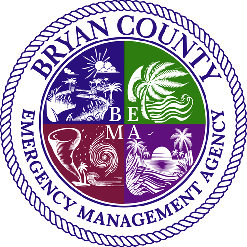
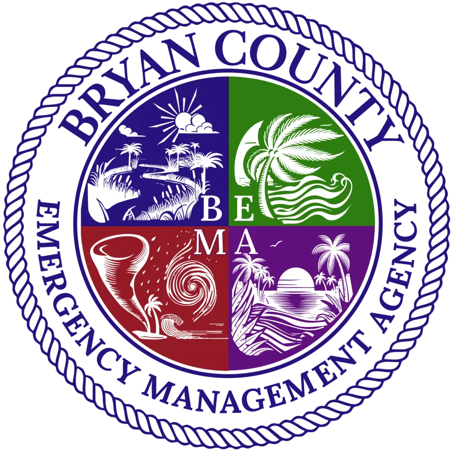
When Bryan County Emergency Management (BEMA) became its own standalone department, it needed an independent logo as well as a brand identity that the community could immediately recognize and trust.
The goal of this project was to create a visual identity that reflected the department’s mission while balancing authority with approachability. Emergency Management exists to help the community prepare for, respond to, recover from, and mitigate the effects of emergencies, but it also serves residents every day through planning, education, outreach, and preparedness.
The Challenge
Emergency Management had always been a part of the county's services, but with a growing county and the increase of events impacting the area, the need for a independent department with a Director focused solely on emergency response was evident. The new Emerging department required its own recognizable identity while still maintaining a visual relationship with Bryan County.
The new brand needed to:
- Communicate confidence and professionalism during emergencies
- Remain approachable during everyday preparedness campaigns and community outreach
- Work consistently across uniforms, vehicles, social media, presentations, print materials, digital communications, emergency alerts, and public events
- Establish an agency that can be relied on to impart information and respond swiftly and efficiently
Most importantly, the brand identity needed to become what residents could recognize and trust whether BEMA was communicating with the public or managing an emergency event.
Designing for Recognition
Emergency Management traditionally relies on dark colors, shields, and tactical imagery. While those elements communicate authority, they can also create a sense of fear or distance. The brief that I received from the head of the department was to "create something that didn't spell doom and gloom, not necessarily fun, but fun adjacent".
My design direction focused on creating an identity that felt approachable, relatable, prepared, and dependable. Drawing inspiration from Bryan County's coastal landscape, and a simple yet important concept:
BEMA is there, day or night, before, during, and after any emergency.
That concept influenced a series of four environmental scenes representing both the region and many of the hazards the department prepares for. Sunrise and sunset reinforce the idea that BEMA serves the community around the clock, while the surrounding imagery reflects the local environment residents immediately recognize as home.
Rather than illustrating those phases literally, the design communicates them through consistency, reliability, and a recognizable visual language that can support each phase of the department's mission.
Building a System from Branding
The final logo was the foundation for a much larger visual communication system. The color palette was chosen through combining Bryan County brand standard with specific color cues to create a long term hierarchy residents could quickly understand.
Each primary color was assigned a communication purpose:
Red - Severe threat emergency alerts, and situations requiring immediate attention.
Green - Prepare now information, developing weather systems, and situations residents should begin monitoring.
Purple - General information, educational content, awareness campaigns, and community preparedness messaging.
Regular communications and graphics always combine these with Bryan County Blue for routine announcements, and standard public information.Creating a recognizable color consistency.
County typography, supporting graphics, and visual standards were also established to ensure consistency across every public-facing communication.
Expanding the Identity
The identity continued well beyond the logo itself.
BEMA's Facebook presence received its own recognizable header and a coordinated system of social graphics encompassing the many areas the agency touches—from preparedness and developing weather conditions to emergency response, recovery, and citizen education.
For BEMA's emergency response vehicle, elements of the seal were carefully disassembled and reconfigured into a distinctive side graphic. This allowed the vehicle to carry the full character of the brand at a scale that remained recognizable while moving through the community.
The system also expanded into EMA Allie, public handouts, website assets, and supporting documents created for citizen education and everyday use.
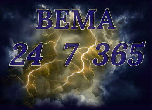
Animated lightning surrounding the logo became another memorable visual signature and helped reinforce the #BEMA 24⚡7⚡365 campaign—emphasizing that Emergency Management serves Bryan County every hour of every day.
Together, the logo, color hierarchy, vehicle graphics, social media, motion design, and educational materials created a cohesive visual language residents can immediately associate with Bryan County Emergency Management.